This new age is all about personalized and digitalized services. every healthcare, medicine and pharma company is demanded to offer the most cutting-edge innovations to stay relevant. of course, this should be paired with a personalized approach – addressing the client by name and other details – and all services should be available now and everywhere.
Be at the forefront of
Israel’s health revolution
Connecting the dots
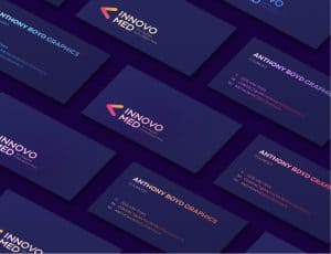
innovation and progress were the key values in our innovomed branding strategy. at the same, we incorporated more professional and formal elements – appealing to big healthcare corporations and companies.the color palette for the brand was shades of blue, representing the traditional healthcare field. we combined those with the contrasting and daring colors of yellow, orange and pink. we incorporated in the innovomed logo a colorful icon by connecting dots. this represented the ties and bonds the company makes between different points around the world – finally, creating a whole new picture.