

כללי > Maof laamith
During the great labor market revolution following the COVID-19, professional associations across the country protected labor rights by negotiating fair wages, maintaining a work-life balance, and improving working conditions.
The MAOF Union (The Union of Clerical, Administrative & Public Service Employees – UCAPSE), being the largest professional association within the General Federation of Labor, has changed the rules of the game in the Israeli labor market. The Union saw the great revolution as an opportunity to carry out rebranding processes and to refine its strategies, supporting and protecting employees in today’s new labor marketplace.
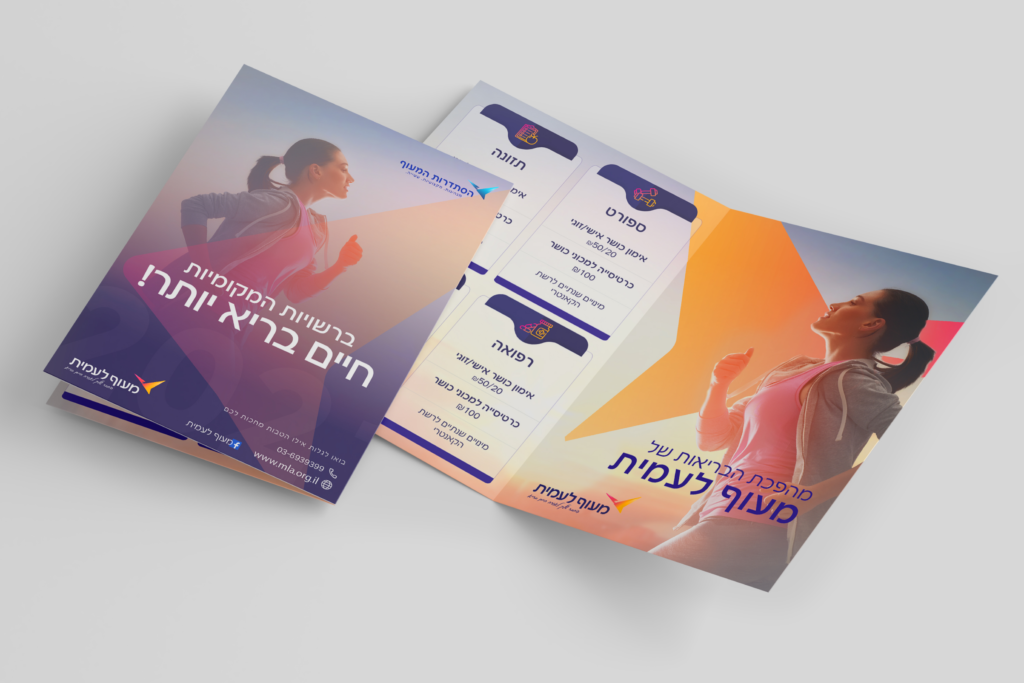
The Maof Union devotes a great deal of effort to promoting the status of its 240,000 members, including, among others, municipal, university, insurance companies, banks, health funds, SAI, and MDA employees.
According to the Union’s request, the UCAPSE should be positioned as an elite entity within the General Federation of Labor, engaging and promoting changes in fair wage agreements, employee development, social conditions, fostering a quality work environment, and planning the future.
As the rebranding process took place during the COVID-19 pandemic, which accelerated and boosted the oncoming changes, we were able to see how the Union is addressing these challenges: by introducing wage agreements tailored for hybrid work, training workers for relevant positions in the new market, and safeguarding workers’ rights.
Throughout the joint branding process, we have witnessed dedicated, efficient, and fast work of the organization, thanks to the social cohesion and solidarity of its members. The UCAPSE aimed to further enhance its strategic branding process by strengthening the sense of belonging and pride among both its members and employees.
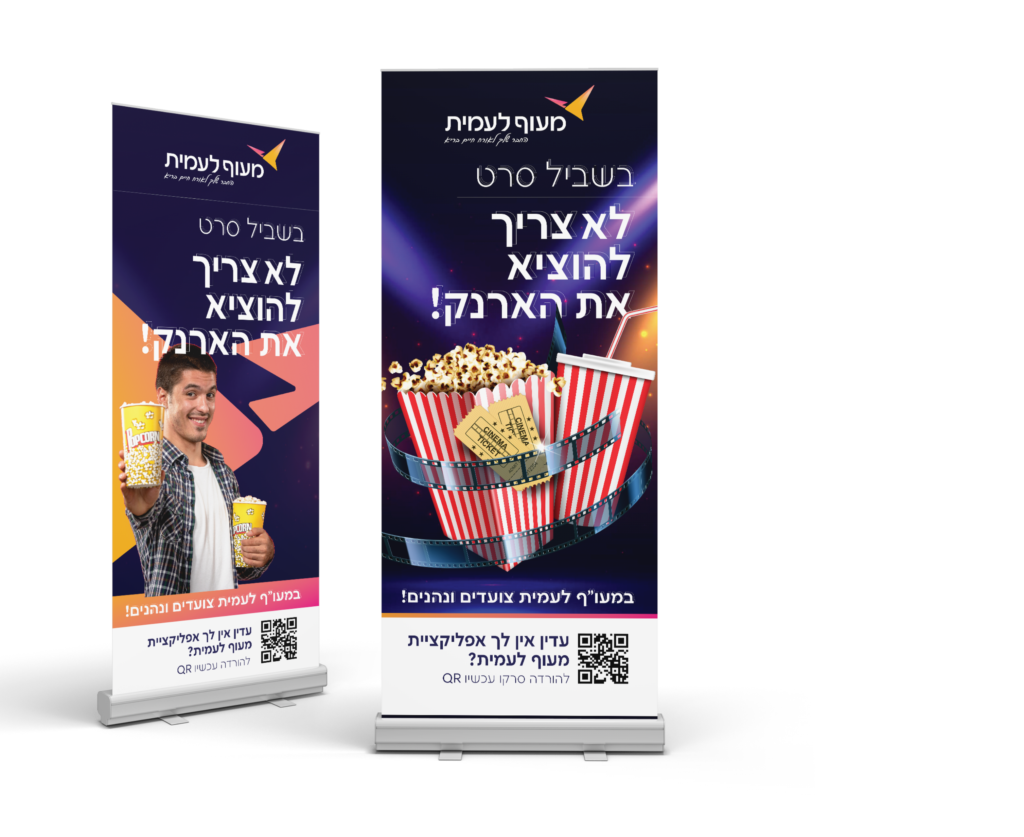
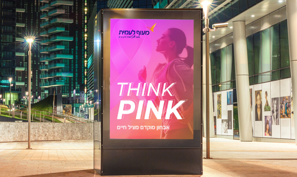
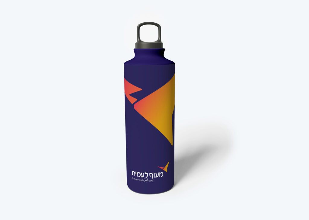
Maof Unity’s labor market activities are based on adjusting and leading the market forward while maintaining the values that led to its establishment.
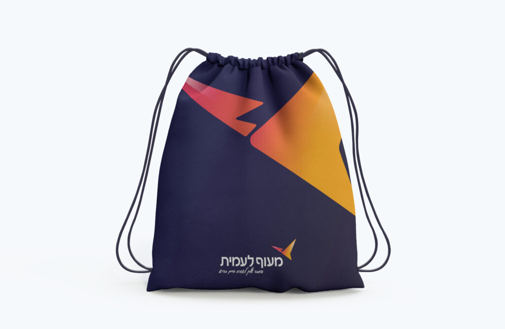
This vision guided us in the rebranding process. Thus, we have renewed and updated the traditional bird element logo, which became the hallmark of the association. Based on the bird element we designed a logo that resembles an arrow and symbolizes upward movement.
Blue shades establish an intuitive connection to the General Labor Federation through the branding. The combination of gradient shades represents the interconnection of past, present, and future, emphasizing the process of change.
Gil Bar-Tal, Chairman of the UCAPSE
“We received a clearly defined outline that is easy to work with. This reduces the need to “invent a wheel” in every process, thereby helping us to be more efficient. The brand model developed for us reflects the nature of the work we do and the way we work together, since it combines the formal and the informal aspects to give us a feeling of togetherness. Each event we hold today looks and feels professional, gives a sense of unity and cohesion, and contributes to the pride of the team.”
OrderArt branding agency 2020 ©
WhatsApp us
