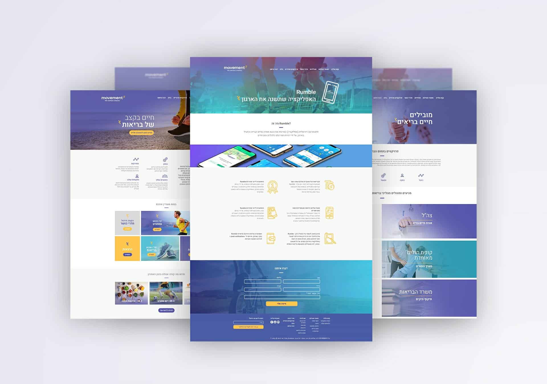
Movement is an industry leader promoting corporate wellness and health across Israel. For the past decade, the company has led a widespread change in how Israel’s largest corporations view and value their employees’ mental and physical health. As a result, employee motivation, productivity and job satisfaction have increased. Though they have been in the game quite some time, companies were now required to be more high-tech and offer more personalized services to individuals and organizations. Thus, Movement recognized the shift in the market’s and organizations’ needs – adapting with time is crucial.
Re-Branding Re-Empowering
This change called for a new identity, or in other words, for a smart branding strategy. The strategy we, at Order Art, have designed relies on Movement’s strengths – it’s extensive experience in the industry along with its knowledge and impeccable reputation – but at the same time, it strives to paint the company in more innovative and attractive colors. This evident shift allowed Movement to adapt according to current necessities, restructure itself, develop a customized system and platform for individual employees and organizations.
Moving on up
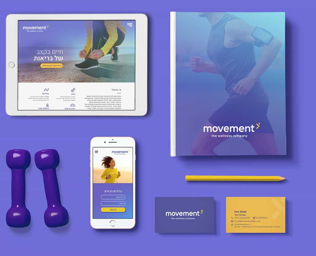
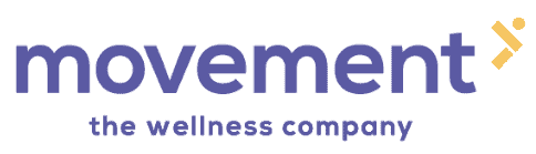
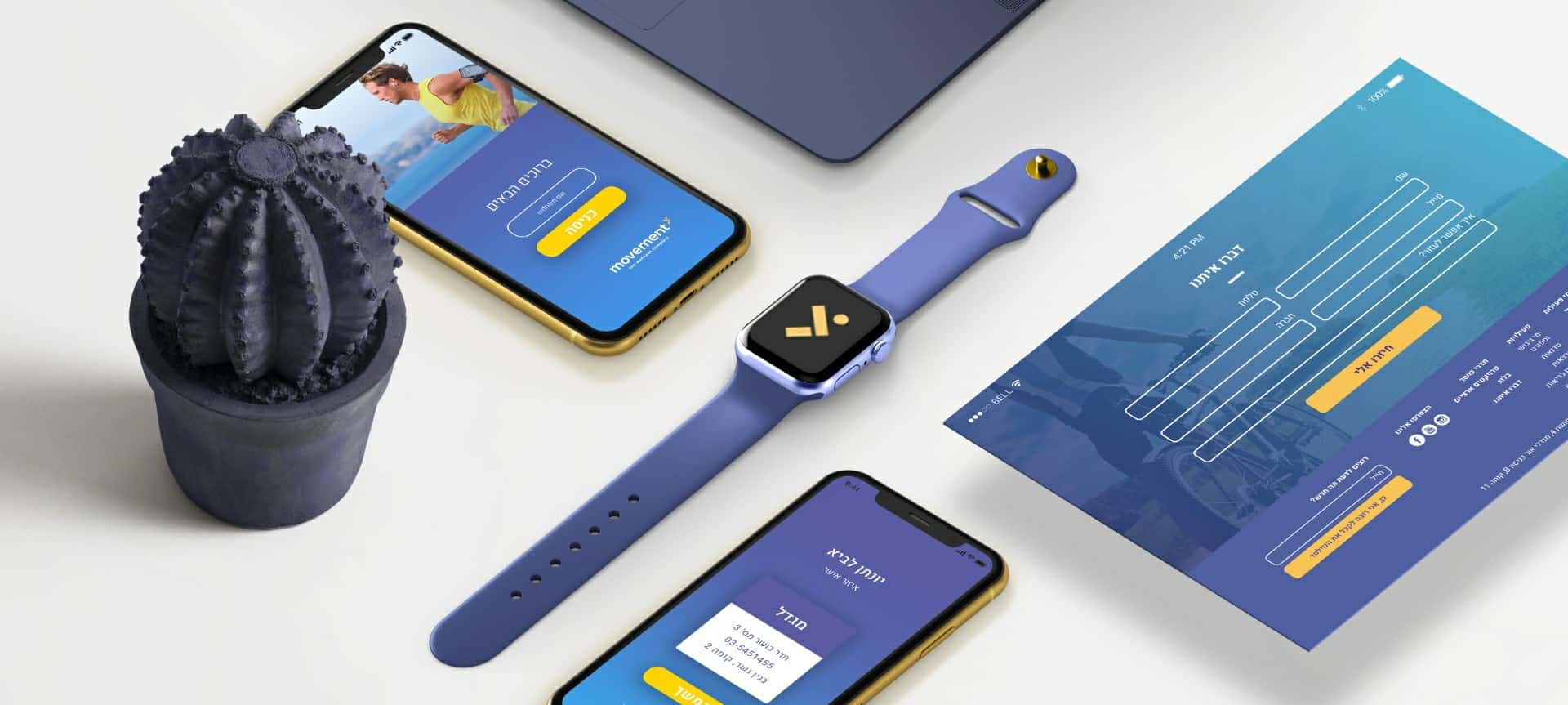
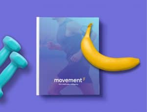
Movement’s new branding and logo is powerful, sharp and impactful. this logo expresses Movement’s vision on a holistic level, promoting wellness and health through movement – both on an organizational level as well as individual. the arrow highlights the company’s movement forward, its strong association with energy, a healthy lifestyle and personal development. the chosen color palette expresses youth, vitality and energy, as the simple classes font exudes professionalism and confidence, establishing the company’s reputation as a leader in the public and private sectors.