Rich, flavorsome and fresh are just some of the descriptions that come to mind when the Vaniglia brand is mentioned. The best raw-materials have been collected from all over the world, to create an utterly unique ice-cream-licking experience. The ice cream they have introduced to the market, is a completely new, top of the line creation, favoring quality and striving for excellence. The velvety and rich ice cream brand needed an overall rebranding that would not only make their values clear but would also educate consumers about this exquisite culinary experience.
Previous slide
Next slide
Previous slide
Next slide
Kiss the Chef (Glacier)
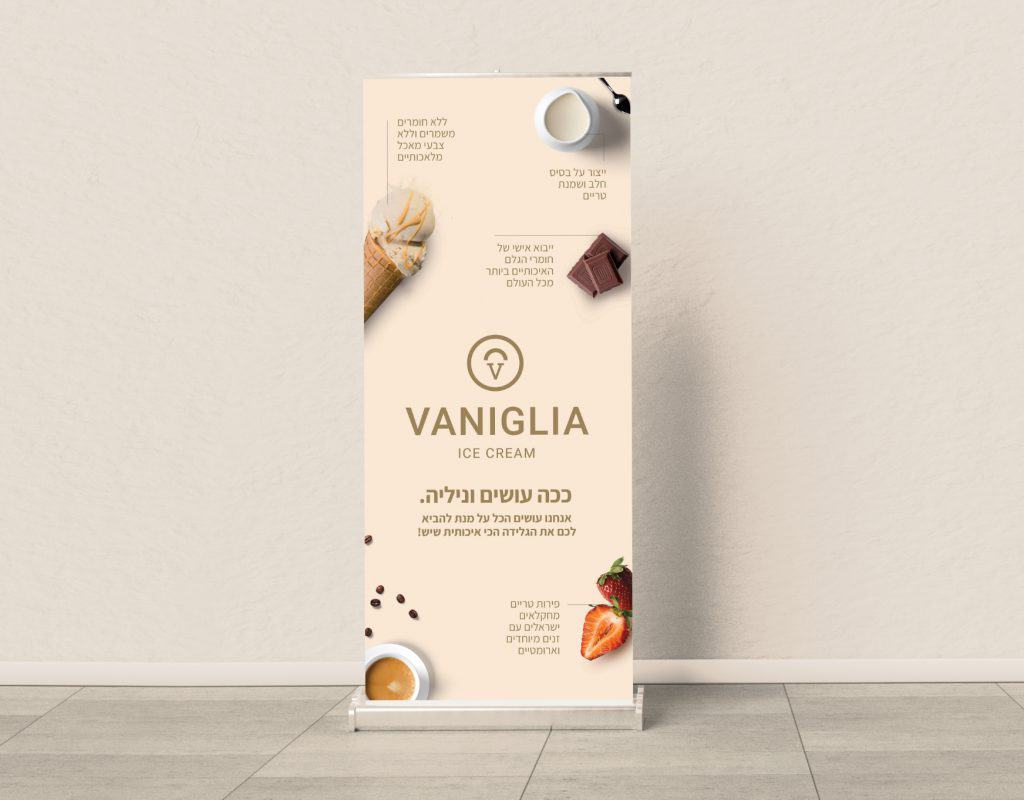
When people think of ice cream in the conventional sense, they don’t always think of “chef”, “delicacy” or even “cuisine”. Our first move was to change that perception. It was significant for us to put forward the fact that Vaniglia’s ice cream flavors were conceived by a chef who travels and explores the world to gather and use the finest, most authentic and unusual ingredients. The brand’s identity was defined by values of quality, integrity and purity. All of which were translated into a visual brand language.
Simple is Always Better
Our strategy was to let the ice cream and ingredients speak for themselves. This is why the ingredients are featured in the front, and the design is rather simplistic and clean. Nothing to hide – plenty to be proud of. The color palette we chose, brown and gold, imply richness but also serves as a stamp of quality. And more importantly, the color complements the ice cream itself and is naturally incorporated with the environmental design of the stores. These colors are also used in the app design, marketing and social media, brand design, signage, print materials; a total and complete branding experience.